Necromancer Set Sprites


#1

So I’ve made a couple items before and each time I am brutally shut down by other people. Occasionally I would get a positive compliment upon my Sprite, or an actually constructive idea on improving the quality of the item. Because my only positives were the sprites I decided from now on I’m just going to post sprites. Feel free to use them in your own ideas, just please leave me credit. Thanks. Without further Ado, here is my necromancer set sprites.


As a little bonus when I was experimenting with different rings trying to achieve a wave look, which was unsuccessful, I tried to recolor the summer wizard ring. I thought it looked pretty cool so I decided to include. YES I KNOW ITS A RECOLOR FOR ALL OF YOU WHO ARE GOING TO SAY IT IN REPLY EVEN THOUGH I WROTE IT UP ABOVE ^^^

Leave your thoughts down below :heart:️:heart:️


#2

nice robe


#3

Thank you.


#4

kewl sprite. free donut from me :doughnut:


#5

First off, don’t stop making item ideas just because people criticize them: it’s just an indicator that you should be doing things differently. I’ve looked at your previous ideas, and they aren’t terrible; here’s a list of things that you’d want to keep in mind.

  1. It’s harder than it seems to actually make a good item idea. Items have to be balanced, simple in operation, add significantly to gameplay, and preferably be skill-based. Very few item ideas, even ideas with unique mechanics, satisfy these points: it’s easy to trade off damage for range or add a different status effect, but this isn’t something that works in the majority of cases (there are already UTs that serve these purposes and they are relatively all-inclusive; adding another UT that does this would serve to decrease uniqueness). Think through your concept and balancing more: for what I would call successful/well-thought-out items, take a look at Xaklor’s or even two of my own.

  2. More than some like to admit, formatting matters. Adding italics or boldface adds aesthetic professionalism to your post, and organization with headings and explanations helps too. This may sound trivial and superficial, but it’s true that we all unconsciously judge books by their covers.

  3. Don’t be narcissistic. I recall that you’ve said that you “wanted to make a name for yourself,” that you credited yourself for your sprites, and that you claimed your sprites were great, and that’s a big turn-off for other people, especially if said ideas or sprites aren’t amazing in the first place.

  4. Sprites, sprites, sprites. Keep on practicing your sprites: at this point, they’re alright, but your shading desperately needs work (remember to avoid pillow shading–be more agressive on color differences and keep relative color and color theory in mind). It’s helpful to browse around on the pixel editor for inspiration: check out, for example, the sprites of nmin, thq32df, uomo, dg, sven, piggby, dappertron, and rejaculate and look at the themes in their shapes and coloring. Also, the way you format sprites is less than ideal: take a look at some reformatted sprites I’ve made for you.

    Don’t they look much more professional?
    I’ve even posted a guide about how to format sprites without being tethered to a desktop program like Photoshop, but it doesn’t seem to have made a big splash.

Again, please don’t be discouraged by criticism: take the good and try to improve.

~POWER


#6

Yeah so @PwrNewAcct typed up everything I was thinking, especially about the size of the sprites presented…it’s difficult to see the big picture, when the picture is so big.

The last one; I know that you know that I know it’s a recolour, but this particular palette of blues and greens have been thoroughly overused since winter reskins came out. I think some spring-themed sets are in order.


#7

Thanks.


#8

Thanks for the support and advice. The when section about narcissism I do not agree with. I was trying to come off as cocky or some big shot Sprite maker, I just wanted to make my descriptions better with using some adjectives. Obviously using words like great and amazing were just IMO and weren’t going to hold with everyone. The whole “name for myself” thing was shot down in about 2 posts with the overwhelming amount of negativity from everyone. Whenever I try to make something balanced it ends up mimicking another item and I get called out for it, and whenever I do something special I get called out for how hard it would be to program and people saying it’s stupid. I’m tired of being hurt in that notion, which is why I am just making sprites. Also, how can I improve my shading? I thought my shading was pretty nice but I guess not.


#9

Pretty trippy to look at. Feels super aesthetic. :sunglasses:


#10

Idk if that’s a good thing :joy: But thank you nonetheless


#11

Honestly, these are probably your best sprites yet, save for the staff and ring. I like the robe, skull, and set skin (much better than your last Phylactery rip-off).

Nonetheless, this should be in #community-hub:art, so I’ll move it there.

Everything POWER said is true, by the way.


#12

Personally, I don’t really care if something’s hard to program; after all, these are just concepts. I understand that some have concerns about practicality (programming, lag, hackers), which shows a philosophy that ideas should be judged on implementability.

You have shading, which is a good start, but that doesn’t mean your shading’s great. You tend to pillow shade (using a uniform shadow gradient without a definite light source); while this is less detrimental to 8x8 sprites than, say, 64x64, this gradient looks ugly. There are, in general, two types of sprites that look good in realm: those without shading at all and those with effective, realistic shading.
vs
Notice that the former sprite captures the shape well while retaining an aspect of simplicity, while the shading in the latter is more nuanced than what you have done.

I’ll focus on the latter one, as this is more fitting with the more modern aesthetic of newer untiered items. I will make the following observations on the latter:

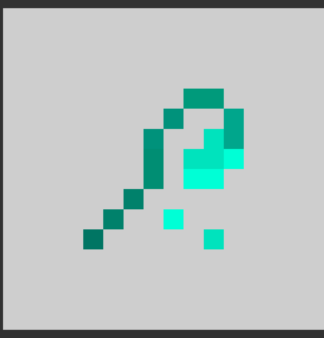
  1. The shading is is nonuniform but not arbitrary. Part of the elegance of pixel art is the perception of complex textures: you must be ambitious enough to color two neighboring pixels with starkly different shades, even just for shadows. Convey a “rocky” texture with locally grainy pixels, still with a larger theme of dark and light; convey a “silky” texture with a subtle vertical shading. Look at your ring:

    This doesn’t look like a gemstone, but rather like an undershaded rock. Gemstones tend to have very bright shining patches.
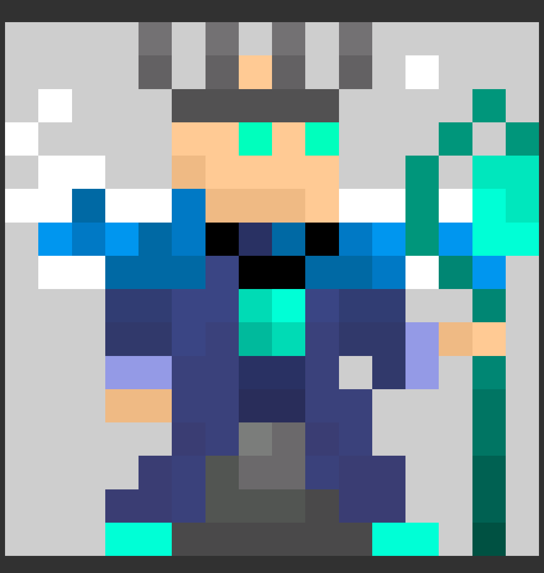
  2. Shading does not mean simply darker shades: there is far more to it. Take a look at the staff of the crystal serpent (specifically the crystal on the staff):

    Notice that the lighter section is not just a lighter version of the darker section but rather a different color altogether. This is one of the best color schemes in ROTMG, in my opinion.
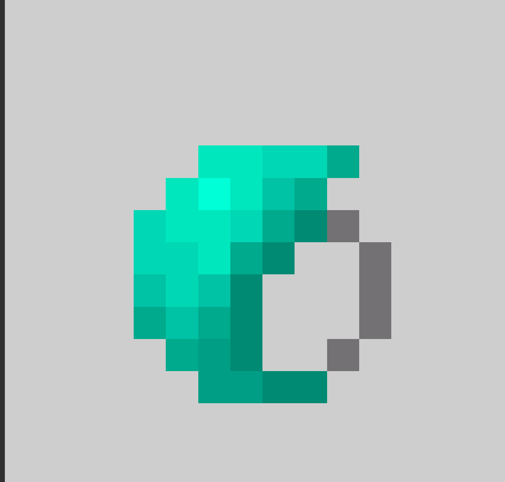
  3. This takes more practice, but the other aspects of your sprites are not great, either. Be more ambitious about varying your shapes and orientations; combine different colors in a more organic yet intriguing fashion. It’s ok to use disconnected pixels, but don’t overdo it; different color schemes or gradients (ex. “sunset” or spectral") may be preferable; feel free to blend and mix colors in original ways. Below are some of my item sprites that may illustrate this:

Best of luck with your future endeavors!


#13

Thanks for taking the time to help me get better with sprites. I will definitely keep all you have said in mind. :heart:️:heart:️


#14

Lol I’m really positive with your ideas! Although some of your ideas aren’t good, they are on the right path and I really look forward in you making more ideas and sprites! Please don’t give up just because some have been rude to you about your efforts, you’re doing great! I hope to see you continue in making ideas, no matter what kind of feedback you get! Your sprites are great! Here is a :candy:!


#15

Thanks man
Really brightens my day to see the side of the community that cares. <3


#16

should I use the rotmg editor?


#17

Yeah, the people I referenced are only those using the editor because their sprites are easier to access. The rotmg editor has its conveniences, but I still prefer using a standalone program because it’s just so much more flexible and manageable, even if creating the rotmg aesthetic may be a bit harder.


#18

This topic was automatically closed 60 days after the last reply. New replies are no longer allowed.