Reviews for Sprites


#1

Alright, so right now I’m attempting to make some sprites for a few ideas of mine, but I realise that by my point of view, my sprites look pretty bland compared to others’, along with the fact that I am absolutely horrible at creating 16x16 sprites.

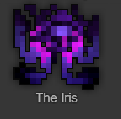
I’ve done a few sprites so far, the purple ones (Iris and the three leftmost items) being an experiment with different shapes for items, while the other three items are meant to stay a bit more faithful to Realm’s art style, and would like to ask for some feedback on it.

By the way, in case the items might not be that obvious, Zenith of the Rift is meant to be a skull, “The Analysis” (The Analysis Report) is meant to be a scepter, and “Voidly” (Voidly Enlightenment) is meant to be an orb.


#2

the pink in all the sprites just has to be toned down a bit.

and i think that “the ring of the final” is a pretty bad name… plus it docent look at all like a ring

also : chest plate of the

this “the” guy must have been cool to have that chest plate.


#3

Was going for a bit of a more purple-ish theme for the items, but the other shades of purple seemed to blend in too much.

Also, don’t mind the names that much, the draw tool just chose to not list down the full names.
(Ring of the Final Battle)
(Chestplate of the Jotun)


#4

Ring is kind of a mess, but the chestplate is amazing! :sunglasses:


#5

Wow, I actually like the 16x16 Iris! The four items do appear to be Cronus-themed, and I like the other items! Though the ring looks like a white Simon Says.


#6

The Iris looks very abstract and unique, and I think the purple shades fit it very well. Keep up the good work!


#7

I liked the chestplate the best. The color scheme and the contrast between certain parts of the armor is amazing, really.


#8

Chestplate is dank asf


#9

This topic was automatically closed 60 days after the last reply. New replies are no longer allowed.