I don’t care whether you all say Arachna.
This abomination of a Wizard skin needs to be erased from my mind.


I don’t care whether you all say Arachna.
This abomination of a Wizard skin needs to be erased from my mind.
THE WHITE SPOTS ARE THE EYES?
WAIT ACTUALLY
WHAT?!
SO CONFUSED
I never knew that I am mindblown
omfg, all this time I thought that the troll was bald and they had a purple fur coat on. What’s wrong with me…
Covert has a white bow string! Unique! until k-shot bow came along…
![]()
AH but it is a simple sprite from simpler times. For perceived laziness of tops, it is a theme/thread running through all the tops really, best ones being:
![]()
![]()
![]()
![]()
Tops are just the top of the tier, no need to get too bonkers on their design, IMO, save that for the UTs. But of course it can be your least favourite! It is opinion after all! 
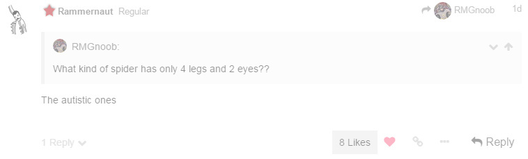
Autistic people often need to engage in repetitive behaviors (for example the classic “sit in a corner and rock back and forth forever”) and can be extremely sensitive to stimuli (including those received by way of touching), not to mention generally incapable of a normal body language.
Combine all these things to a severe enough degree and it’s not going to be easy to move well.
I dislike a lot of sprites, but I really dislike Septavius. Not because it looks bad, but because it’s just an inverted Ghost God with red eyes. Almost no effort there.
When your post gets flagged and everybody likes it.
I never realized that, thanks for showing me the ways xD
Also, giving arachna a bit of shading would be quite nice.
Probably the sexiest dungeon so far…
In terms of mechanics and experience though it’s pretty lackluster
Not really thew worst but one sprite that I really dislike is the hydra skin. If it just had the same amount of pixels as the other leather amors it would look dope but imo it looks really weird the way it is. It should in anyway also get some other bonus except for the +1 dex too to make it a bit better.
The two red portions on the black area around his head are the eyes. I don’t know if the third red pixel is a third eye or something, but that whole thing is definitely a hood with glowy eyes peering out. The Forgotten King did it better, though.
Anyway:
Janus the Doorwarden is such an oddity, because the sprite isn’t actually horrible on a technical level, but it’s such a horrible design. I don’t know exactly how one would go about making a door monster, but this isn’t it.
Dr. Terrible is the ugliest thing in the Mad Lab.

Even back when it was only the fevered dream of LordShon in the Wildshadow Forums, it always struck me how bizarre this coloring was. It looks like a bad recolor of a sprite that you would see pop up in the Art Maker from time to time.