Marble Colossus New Sprite


#1

Hullo :3

I think that the Marble Colossus has one of the worst sprites in the game.
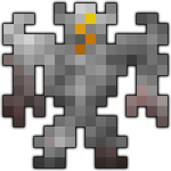
I believe it was originally made by Typemaster, whose aesthetic canons I have long called into question.

  • It is highly overshaded. Yes, enemy sprites do generally get more detailed with difficulty. But this is not detail. It is simply an eyesore.
  • It is subsequently flat, lifeless and messy.
  • It is irritatingly asymmetrical. This makes him look unbalanced.
  • There is minimal contrast between the ‘eyes’ and the rest of the head, which makes them look even more out of place considering the totally stunted colour palette.
  • The light source is not only frontal (unlike more or less every other enemy sprite) but impossible unless the ‘marble’ (which by the way is seldom dark grey) was phosphorescent. Heaven knows why that left hand is lighter than the right.
  • He does not look powerful, despite being one of the most powerful enemies you can fight.

I drew up an alternative which I feel addresses some of these issues. Of course, it ain’t perfect :3

I tried to keep the sense of bulk and physical strength - the extra pixel width needed for symmetry even perhaps increasing it. The golden regalia extends the tones of the ‘eye’ motif, while the purple was chosen because it links to both the ‘magia’ used by the Colossus and the Void Entity. I also tried to make him look more marmorean, so that the paladin set fits his aesthetic better.

I am fully aware that aesthetic changes will likely accompany the lost halls redesign, and I am also aware that a more reasonably shaded MC sprite is out there for consideration. I just felt like sharing this overhaul I chanced to mould in play, I just prefer it to the original form.

This is also my first topic that isn’t a dungeon xD hope you enjoy <3


#2

It does look much better. This is something I would like to see replacing the current colossus, and the clever addition of purple and contrast between parts makes him seem more like the mechanical thing he is.

Great work for your first non-dungeon idea!


#3

in my opinion marble colossus have good sprite it look like a “rock” and i like rock
#######rock pet


#4

i perfer the original MBC since i personally think he looks good since he resembles a rock. rocks have like a billion shades of color so i mean…

pls dont kill me


#5

it should still be a bit better though. i agree with this.


#6

Damn that sprite looks very nice!


#7

I respect you a ton, Pofs, but I can’t find myself enjoying this resprite. I’m not sure if it’s the general shape or the color choice, but I don’t like the sprite that much. The red and over-bulkiness seem to be my biggest gripes with it.


#8

I like the new sprite, but I think the fact that the old is asymmeticrical adds…a certain feel to the sprite that I can’t quite nail down.

Also, the Lost Halls needs a complete resprite before your sprite can be included. I think your sprite is much better, but doesn’t quite fit into the aesthetic (which is questionable in the first place)


#9

Thanks for the comments guys, (of course I’m bound to think my version is infinitely superior!) although no amount of persuading will ever get me to concede that the asymmetry of the original is anything less than hateful xD


#10

The dungeon is getting a complete art makeover in LH 2.0, and the Marble Colossus will be included in that. To be perfectly honestly, I can’t say I’m a huge fan of this version, but I am quite pleased with the one we have now. Hopefully we’ll get to reveal some of that soon.


#11

As Toast said we have an art makeover that will be coming alongside the rest of the changes to the dungeon, I greatly appreciate the passion you put in improving the Marble Colossus sprite however it’s highly unlikely that we’ll use it.
The new version we have is one of the changes I’m really excited about and from a quick look it seems to fix most of the problems you have with the production version so I hope you’ll be looking forward to it!


#12

It looks amazing!


#13

I agree almost exactly with Atrapper. But, The fact that the “lost halls” is sort of a labyrinth or underground tunnel, it just clicks having the Marble Colossus being made of you know… Marble or stone.


#14

I’m fine with both sprites, but your description of making it… this is probably the most well thought out player made Sprite I have ever seen, but I like the asymmetrical lumpy stone version because it adds to ambience, remember these are the LOST halls that have been buried for who knows how long and is full of weird critters and possessed crusaders, so a big statue is not going to remain magnificent and symmetrical, it’s gonna look worn down and broken from the savage things in these halls.


#15

…It looks like a fucking robot.
I like the sprite but it seems…out of place.


#16

I like the sprite its very cool


#17

i don’t like your sprite, the current sprite looks good, you just added some random things to his body, whose don’t look good


#18

I’ve got a suggestion for you. Keep the original sprite and revamp it again, this time a little more rocky, and a little less bulky thingy. Just an opinion.

Pls no flame


#19

Both have its own pros.

That’s true. I kinda like rock too. It gives off a more natural setting. HOWEVER, although the new sprite gives a little more unnatural show, I love that it has more details and depth, possibly making the game more interesting. And, hey, you added pretty dank shading to it.

I respectfully disagree. The gold on its wrists are obviously metal wristbands, and the gold around its waist, I suppose is its belt or something.


#21

Thanks so much for all the feedback! c:
I think the main thing people are missing is that its a MARBLE colossus, not an arbitraty stone colossus.
Marble is typically very pale. I am aware that Elusinian marble is black/turquoise, but it is seldom ever flat-out grey, which all you people seem to adore.

This version tries to sort out the proportions of the original sprite, without being as ‘bulky’ as the one I suggested initially. Having seen the new official sprite, it certainly looks much better than the original.
I’m just trying to gild the lily now c: