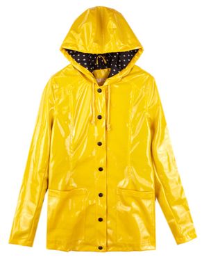
Based on those yellow raincoats+hats that I’ve never seen worn by an actual human being.
Edit 2: Changed eyes and raincoat color.

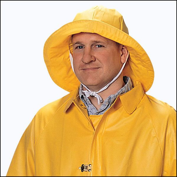
Based on those yellow raincoats+hats that I’ve never seen worn by an actual human being.
Edit 2: Changed eyes and raincoat color.
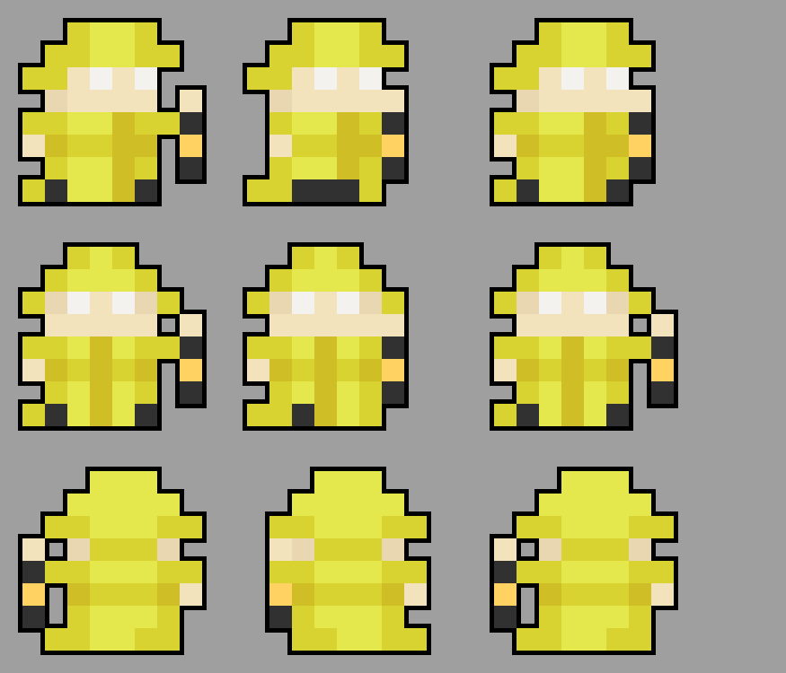
Took me a few seconds to realise the weapon was a lamp sort of thing, but once I did the skin looks amazing. 
I am personally not a fan of this skin. The coloring is a bit messy. The glowing eyes are purposeless and considerably too extreme. The lantern, if it is one, is too difficult to make out and it doesn’t make logical sense for a lanter to shoot out fire.
It doesn’t make logical sense for a necromancer to wear sunglasses and a poncho, but that’s still an official skin. Compared to that, a lantern (you know, the thing that contains fire) shooting fire (you know, the stuff that a lantern contains) isn’t that much of a stretch. And there’s only so much that three pixels can do to make anything clear.
The glowing eyes are purposeless… The entire skin’s purposeless, it’s a cosmetic change. What do you want me to do about that?
As for the colors… besides that one hand that I forgot to recolor, I mostly stuck to the shading conventions of the default skins. I’m not sure how that could be called messy.
Okay, I’ll try to explain every problem that I see with it entirely from a logical standpoint.
2.Again, fair. At first I was trying to make a darker skin tone work, so I made the outfit darker to compensate so it looked weird when I changed the skin.
Uhh… It is a necromancer skin. It’s in the title and everything.
I’ve tried a lot of different looks for the back, but that’s the one that worked the best. If it helps, I based it off these:
It’s supposed to be a belt. Like this:
The hole is part of the old skin tone that I missed when I changed it. The weapon is a lantern and again, I don’t exactly have the luxury of space to convey that any more effectively.
So with all that in mind, does this look any better to you?
I like the lantern. It reminds me of carrying a candle around and seeing the flame blow one way or the other.
I like the general idea, it makes me think of a lighthouse keeper. The colours are still a bit off, but I’m afraid I cannot give you precise advice because I’m really bad at spriting. I like the eyes better in the second version.
Wanted to make sure.
@XommZ if it’s to be a lattern, make it larger so it’s more clearly a lattern. Also, if it is to be a lattern, the attack pattern makes no sense unless the raincoat necromancer is splitting open the lattern and fire is shooting out.
This topic was automatically closed 60 days after the last reply. New replies are no longer allowed.