
Realm of the mad WAIFUS (Fan art) / Kagekami updated 4 April
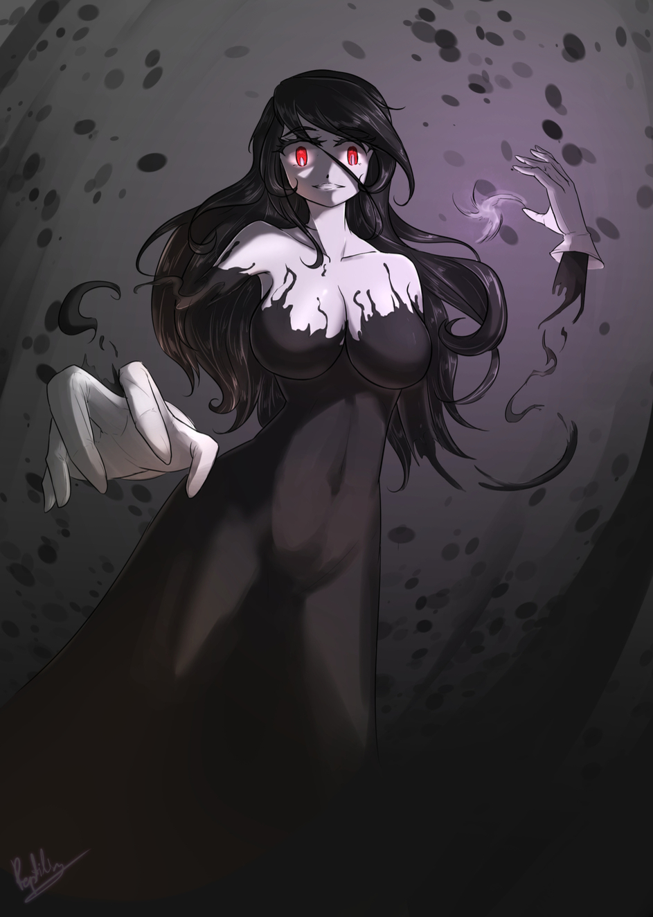
There’s a lot of waifu material and this time it’s “Kage kami” !
Of course, the pixel art version is intended to be more inhuman, male-looking sprite.
But from now on, I will draw every rotmg character in female. For science.
Will science also add di
Looks really good! I especially like how you made the hands detached, with all the black smoke whirling around it.
Also, it’s two seperate words - Kage Kami, with “kage” meaning shadow, and “kami” meaning god.

Thanks! I decided to drew the floating hands because in the sprite, her hands looks sort of detached to me.
and I’m glad I made the right decision!
Also, name fixed! 

This degeneracy should not be allowed on this site 

 . Think about the children
  and me.
but mostly me 
 .
.
(Nice art work tho, I really love the shading and vortex background behind Kami. Body is very spooky as well and really captures the other worldly feeling the sprite was missing. The use of color and lighting also is very fantastic as well, the purple colors work amazingly well with the very darkness in the picture to create a scene that looks realistic and ominous).
The pixel art version doesn’t even look like a dude or a human, it looks like a burnt twinky that became sentient.
another edit: @Lavendulan i am so sorry
KYOFU NO KAGE!!!
edit: you’re hunting for a manor. you find the right grave. you break it and this comes out. what do you do?
imma take a break before i die laughing from my low effort humor.


 <(pls no)
Ok first this is fricking terrible in my opinion, number one the Kage Kami supposed to be an old maiden and her hair is covered by the hood, and the dress you made doesn’t fit the actual dress she wears, and that’s what I have to say
Note: I would say more but you would be really offended
I wouldn’t say that, the proportions aren’t nearly as wonky as they are on the wind flowers. the original sprite is also extremely vague, everything but the face and hands are a solid, featureless black. there’s room for interpretation. lastly, Lavendulan explicitly mentioned that they will be drawing all characters as waifus, “for science”. even if you don’t agree with that approach that doesn’t make it “fricking terrible”.
attacking the drawing solely based on your different interpretations of a vague and blocky sprite isn’t really nice. if you had actual criticism that would be a different story, although if you did have any it would be better to phrase it as respectfully as possible instead of lashing out like that.
lol now I can’t unsee the burnt twinky of the realm anymore.
Also, Thanks for the long comment! I hesitated a lot about the lightning and color, since Kage kami got two types of bullets, the little purple one and the huge bright paralyze balls. I chose the purple one for an ominous shade and I’m glad it was a right decision!
It’s KYOFU NO TWINKY !!
I understand that our interpretation is not the same and I also think that there are a lot more people who dislike my version of Kage kami, since it’s not the same as what they see through those pixel arts and I respect that.
But I think that’s the advantage of Rotmg and their pixel arts. Same character, same sprite, but a lot of interpretation and variety. With enough artist, this community will see many more version of these characters and I want to see that.
That’s why I want to share my own version of her too.
Thanks! That’s actually why I decided to draw Kage kami in the first place. I feel like the sprite itself has a lot of possibility, and I enjoyed drawing her
Quite a harsh criticism to be made just because it isn’t what you interpret it as. This is a game with art and graphics based on pixels, and most enemies only go up to 16x16. There are bound to be different interpretations on how a certain entity is supposed to look like non-pixelated. Good example would be Shaitan the Advisor, where people had interpretations such as a one-eyed monster, a 2-eyed monster with big fiery eyebrows or horns, and even a pumpkin with fire coming out.
Same thing with your comment on one of my art pieces. You see the Jaco as a pet that is supposed to look scary just because it’s in the spooky family, but I see it as an adorable little jester trying to entertain the player. Both are valid interpretations, and so, we should leave it at that. No need for strong criticisms on differentiated interpretations
edit: Just realised I had never commented on the actual piece before. I love how she looks, really fits her nature as a Japanese shadow god. Also love that detail or having no limbs and just her hands, it’s really unique :>