Requesting feedback on this skin (Iridescent 2k20)


#1

After half a year, I’ve revisited one of my old skin ideas that was given some good reception to see how much I could improve it. Spent a few hours on redesign and coloring with some tips from others, and I would like to see what is the opinion of the Realmeye community. As before, I’m interested in knowing what specific areas of improvement there would be if needed, and so below is a couple of questions regarding them. If you have any additional comments, please feel free to reply to this thread, all constructive criticism is welcome (No need to hold back). I’ll try posting tweaks if I have more time on further improving the skin.

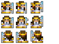
Currently, the coloring for the gif animation is glitched and shows the feet in the movement animations and a part of the dress in side view to show as a different color, I will try to fix this soon. For now, I have also posted static pictures of the skin as well.

Iridescent- Staff Class Skin
iridescent_animated_v1

1
On a scale of 1 to 10, how would you rate this skin?

  • 1
  • 2
  • 3
  • 4
  • 5
  • 6
  • 7
  • 8
  • 9
  • 10

0 voters

Would you use this skin as it is if available ingame?

  • Yes
  • No

0 voters

On a scale of 1 to 10, how would you rate the coloring of the skin? (Ignore the color glitching in the animated gif)

  • 1
  • 2
  • 3
  • 4
  • 5
  • 6
  • 7
  • 8
  • 9
  • 10

0 voters

What issues do you see with this skin as a whole, if there are any?

  • To little contrasting in coloring
  • To much contrasting in coloring (overshaded)
  • Design needs improvement
  • Animation needs improvement
  • Nothing too serious, just some nitpicks
  • Skin is good as it is

0 voters

If you find any issues in the skin, where exactly would they be located, if any?

  • Hair
  • Crown/Headdress
  • Face
  • Torso
  • Arms
  • Staff
  • Lower Dress (2nd to bottom layer)
  • Golden Dress Rim (bottom layer)

0 voters

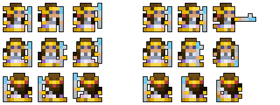
Compare with this earlier version of the skin. What feature of this version do you think is better than the current?
transcendent_shamaness_animated

  • Design of the headdress
  • Coloring of the headdress
  • Coloring/shading of the hair
  • Coloring/shading of the face
  • Coloring/shading of the dress (not including the gold/yellow rims)
  • Coloring/shading of the gold dress rims
  • Coloring/shading of the staff
  • Animation

0 voters

Do you like the concept of the current version?

  • Yes, and it seems original
  • Yes, it seems quite generic but okay
  • Yes, although it seems unoriginal
  • No, although it seems original
  • No, and it seems quite generic
  • No, and it seems unoriginal

0 voters

Do you think this skin is worth adding to the game?

  • Yes, as it is
  • Yes, after improvements are made
  • No

0 voters


#2

The main gripe I have is that it is too shaded, which makes it just look cluttered and not much else. Reduce the amount of shades of gold, brown and white and it will look better ingame. the headgare seems to be different on the sides than the front. I Like the red on the headgear though points for that.


#3

Gold parts and staff need more contrast (needs to appear more shiny), while central part seems overshaded/ too messy. Hair is also overshaded in back frames. That purple pixel seems out of place. I would also make the eyes darker.


#4

In my opinion, the clothing dress have too little contrast and a little too much shadowing. The headdress also looks a little bit weird. Giving the clothing dress a more solid color and simplifying the headdress design might help.


#5

Aside from the shading issue everyone else pointed out, I also have a few things to point out. The color palette is too diverse for such a small sprite. To elaborate:

  • The palette lacks focus. It’s like the sprite wants attention on the gold (the shine of the rim and headdress) but also on the contrasting blues (the value and hue range of the eyes, staff and dress). There are hardly any neutral colors. The brown hair brown drives attention to the gold because it also has shading, and the dress has its own purple/pink gradient going on.

  • The second version accounts for some of the issues previously mentioned. The face and the dress are paler and the hair is shaded less, moving attention away from these areas. The unnecessary red on the headdress is also gone.

  • I think the shine fits the headdress since it looks like it’s supposed to be gold, same goes for the rim. Currently, the eyes seem too neutral for my taste. I think the eyes should have a hue closer to the bright blue part of the staff to help it counterbalance the gold rim. Or you could go the other way and make the staff more neutral so the attention lies solely on the gold and nothing clashes with it. Whichever feels right!

I also notice some of the animation glitches you mentioned and I hope that gets fixed soon!

Overall, pretty good skin. It would have been nicer if the skin showed more iridescence (hinted by the slight purple/pink) as the name of the skin suggests, but it’s hard to pull off in with such a small canvas without the whole thing looking muddy. Really good attempt though! You should try making another skin that focuses more on iridescence. This one has a more “White and Gold dress” feel to it.

This one was really hard to put into words! :sweat_smile:


#6

This topic was automatically closed 60 days after the last reply. New replies are no longer allowed.