[ROTMG Comic] Keepers of the Nexus


#21

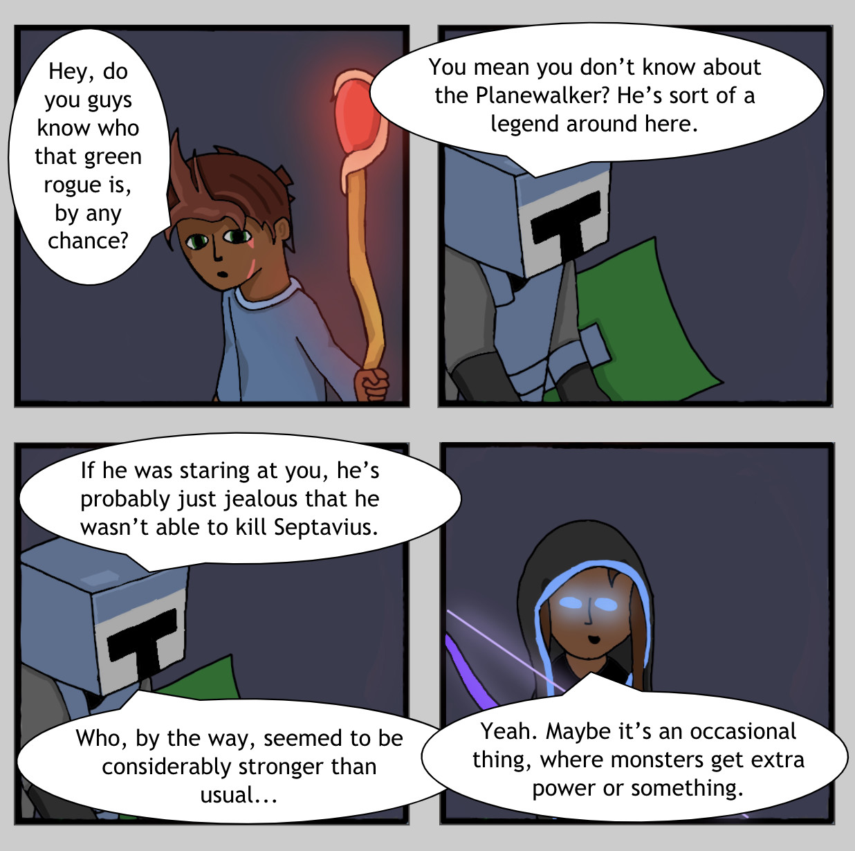
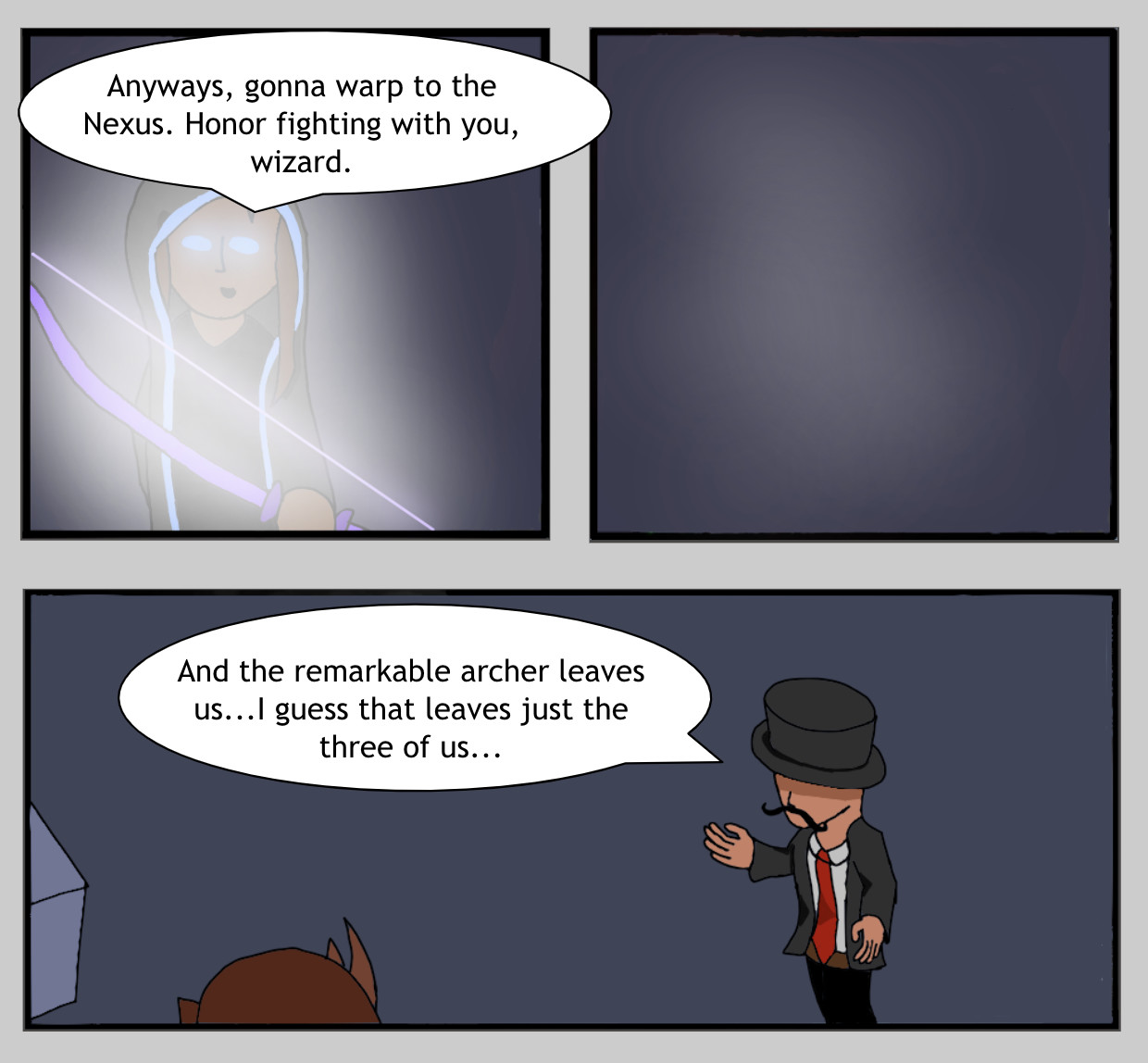
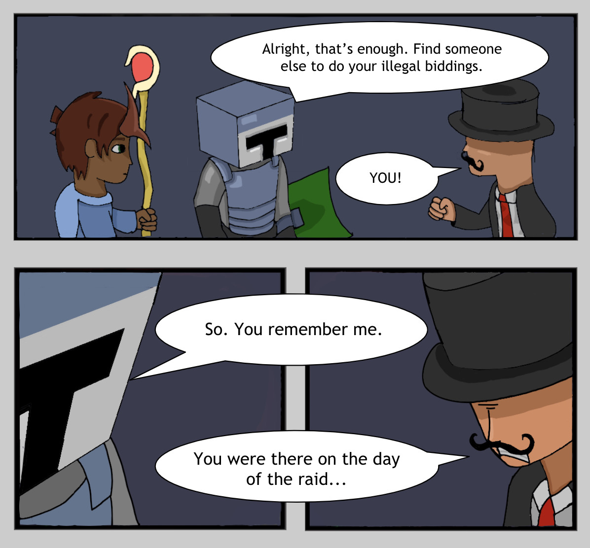
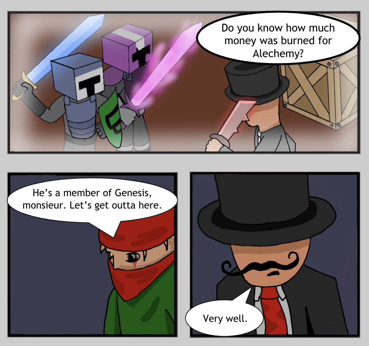
Nope, it’s for real. The good news is, I found something called MediBang Paint Pro and it’s super comfortable to use. It lacks super advanced functions, but I’m able to do special effects just fine, plus I’m able to customize pretty much everything, from the UI to shortcut keys.


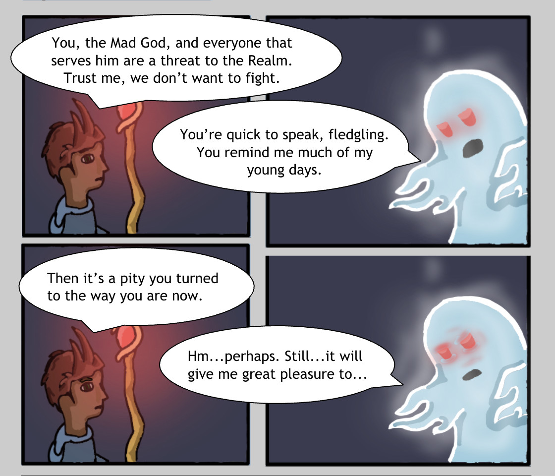
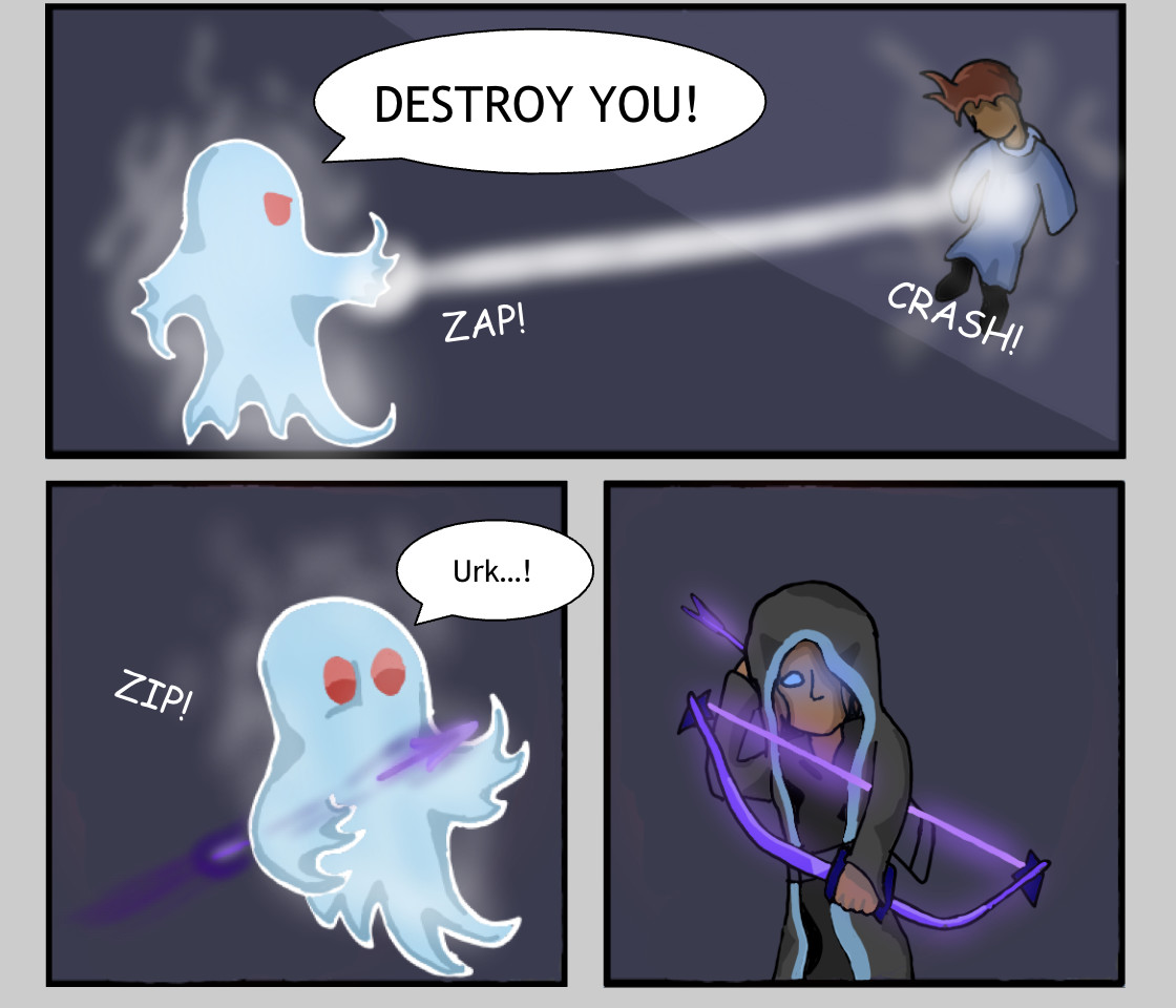
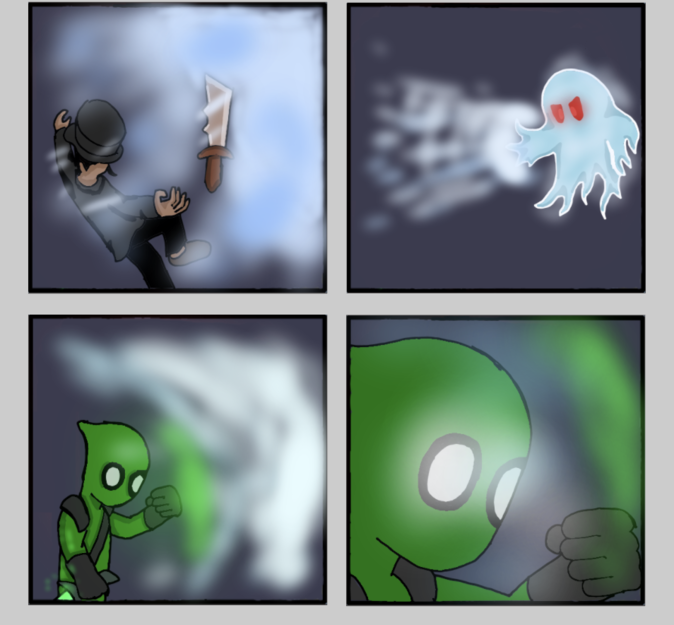
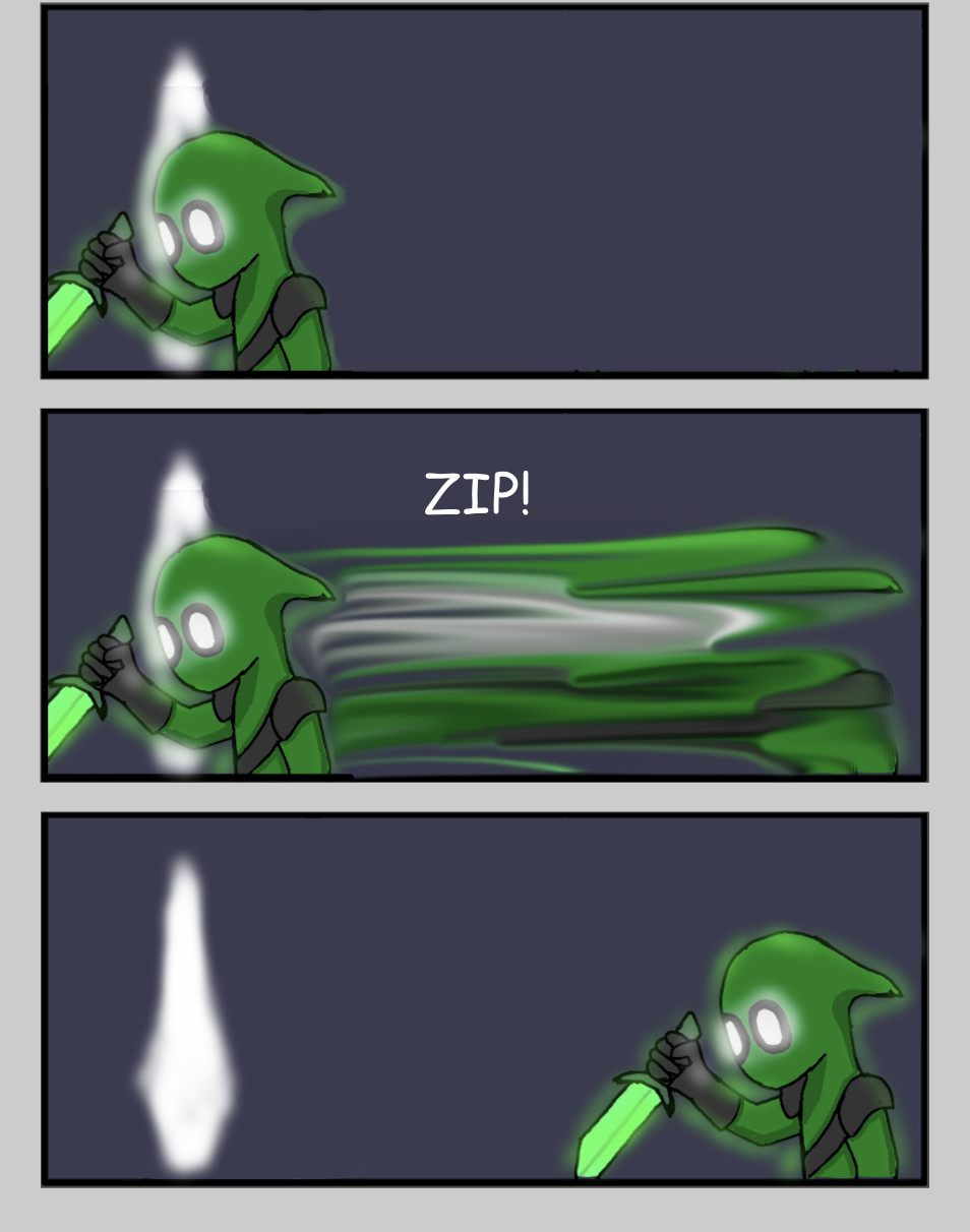
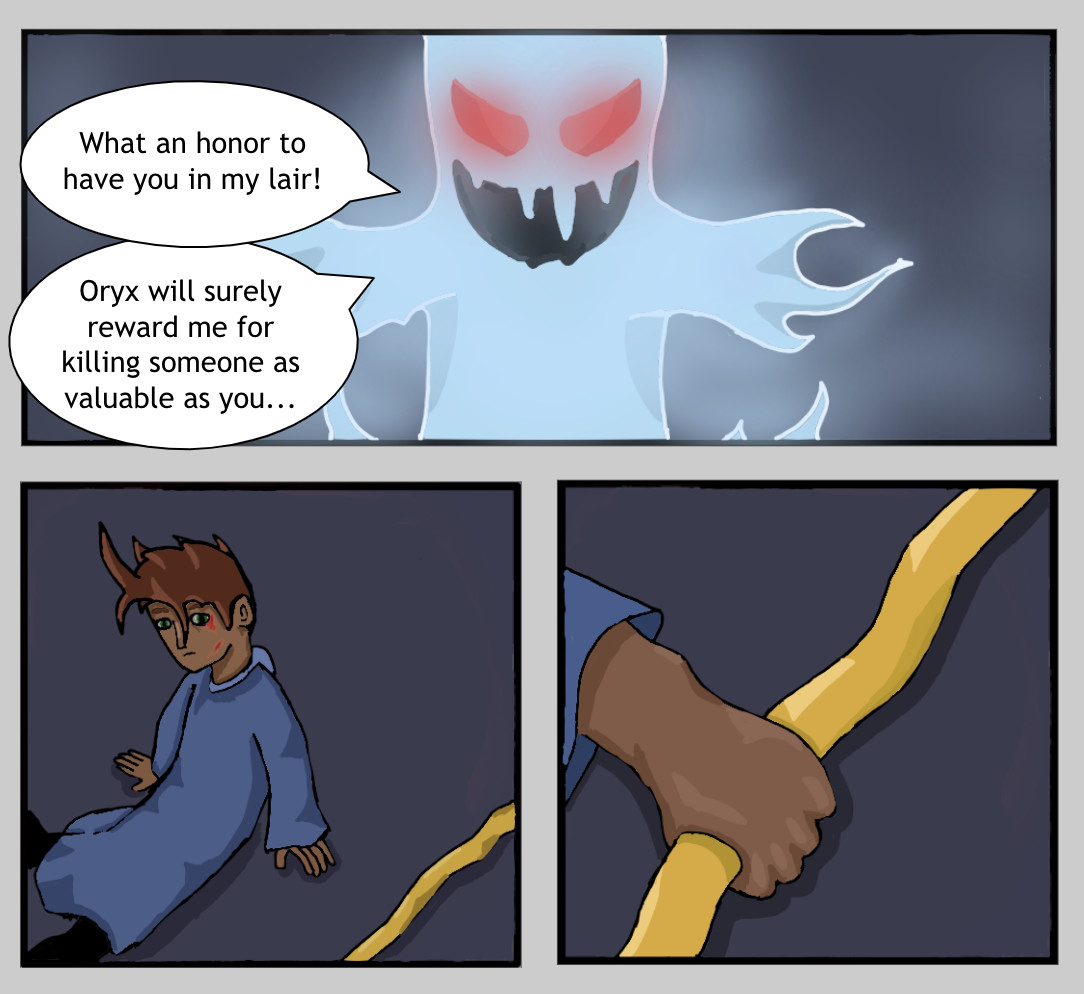
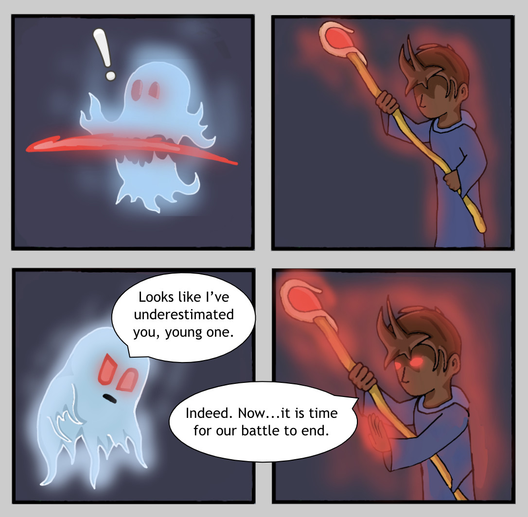
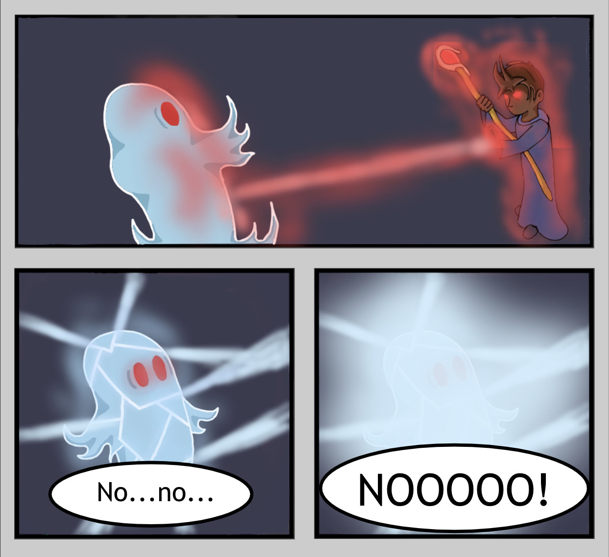
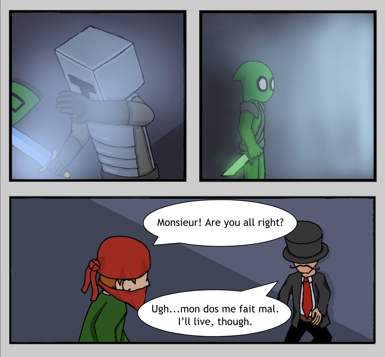
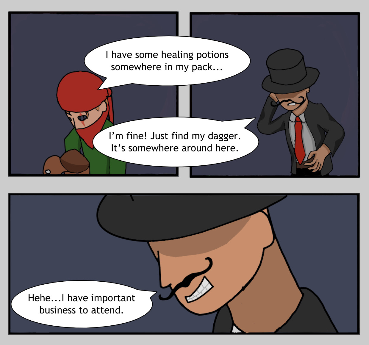
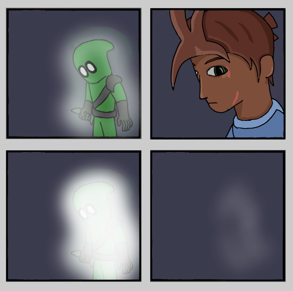
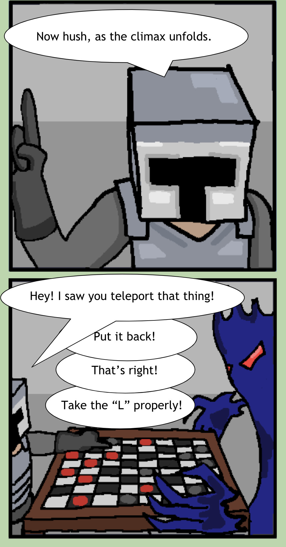
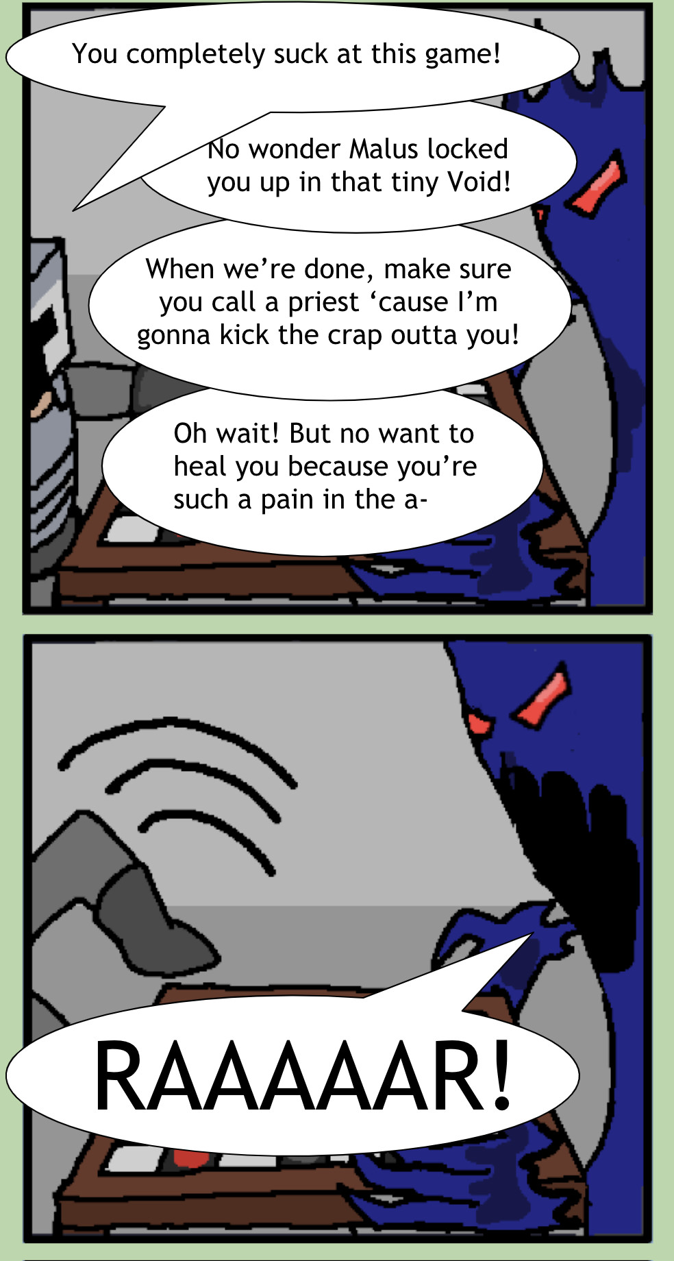
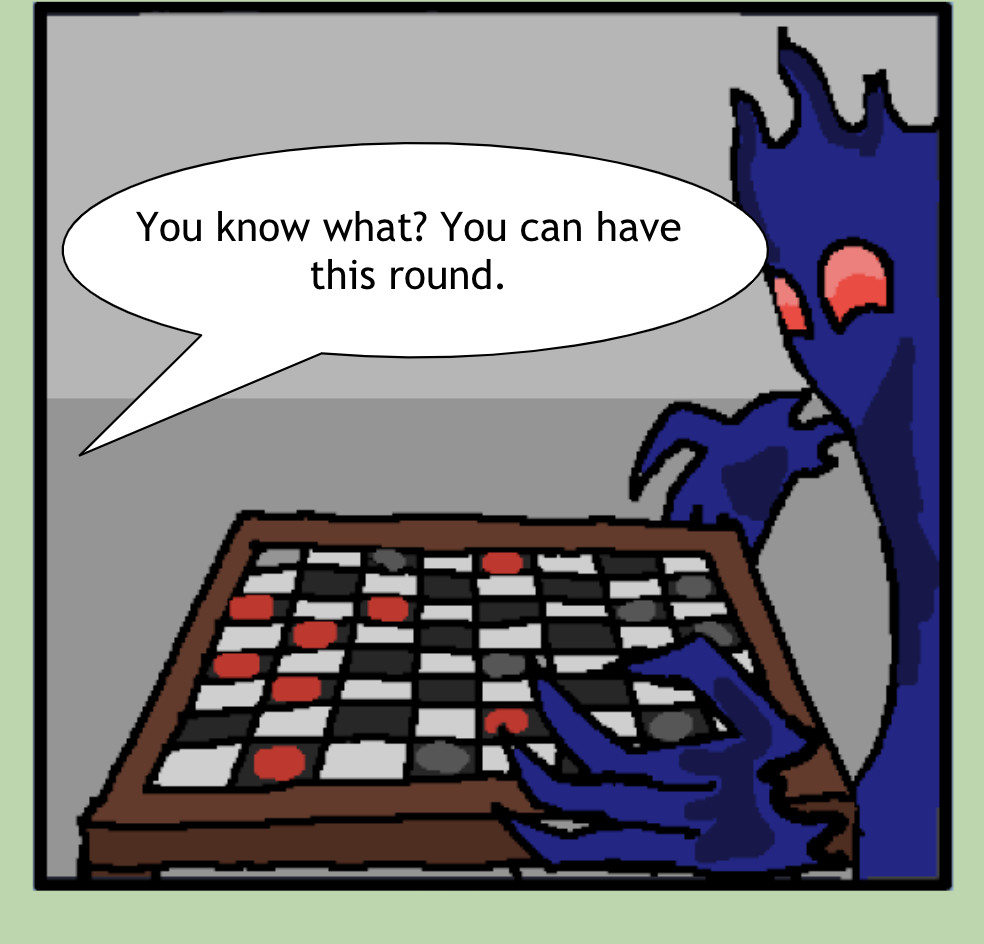
Anyways, I put together the short April Fool’s comic like said before.


Took me ages to get the proportions right – it wouldn’t work for some reason.

Happy April Fool’s Day! Stay safe and try not to get pranked.


#22

May I suggest a new strategy?

Let the Void win.


#23

I finished up the new panels ahead of schedule so I decided to go ahead and post them here. Just don’t get used to me being early. :wink:


NOTE: So apparently my style did change after my switch from GIMP to MediBang. I’m not sure if that’s good or bad, but I was able to make use of several glow effects, which I’m personally quite fond of.


#24

i can’t tell what emotion the wizard is supposed to be feeling right now


#25

“Yep, that’s me. I bet you’re wondering how I got into this situation.”


#26

also to further nitpick, the ghost god looks like he’s daydreaming while being cut in half


#27

Yeah, I guess I should’ve made his eyes bigger to show a surprised face. Hopefully I’m able to add more emotional details as I get used to this. :sweat_smile:


#28

Personally I don’t mind it as much as RareMeat does, but here’s a way

Untitled52_20200403005954

just add like, one curve to each eye and boom, surprised

not sure why that works, but it does


#29

wo now he’s sleepy


#30

no i’m sleepy

it’s 1:30am send help


#31

good luck and have fun


#32

If you add the curves more below the eyes, it would look like eye bags and end up giving a more “sleepy” effect, but the way he did it is fine, though it might look better on the sides of the eyes.


#33

Yea, this definitely is a bit more accurate in portraying his shocked expression. For portraying sleepy characters, the lines tend to start a bit lower and there’d probably be a second shorter line below. Eyes also don’t tend to be fully wide open when sleepy

Besides, portraying him being “sleepy” isn’t technically wrong, since being sleepy also portrays weakness, something most living things feel when they’re about to die anyway haha


#34


The formats are all incredibly messed up, and the dimensions aren’t working like they’re supposed to. If someone could send help, it would be greatly appreciated. For now, this is all I can do. :worried:

Also, sorry I couldn’t get the teleporting thing (last three panels) right.

Also, small hint. The green masked rogue shown is very important to the main storyline, so pay close attention.


#35

I can imagine hatguy as a pimp and that dagger being a pimp cane xP


#36

Did a dialogue redo for the last page. It was just one speech bubble, but I had to make the next pages make sense and I had to rush things on the last day, sooo…only 7 new panels today.


NOTE: The wizard’s supposed to be at least 16, but he keeps looking like a 7-year-old. The comic website for the full layout and character stats will be available by next week.


#37

Sorry for the delay. Here’s a cookie for those of you who waited: :cookie:
You’ll notice that the drawing effort dipped a ton for the last few panels. I drew them in the middle of the night the other day, and I honestly didn’t have the heart to go into detail.


As you probably guessed, the full layout didn’t make it today. I decided to thoroughly introduce the first few characters before going ahead with it because it’s going to include the characters’ stats and stuff (eg. current weapons, former weapons, dead or alive, guild, etc.)

EDIT: Oh, I also forgot. I threw in some French in the middle. It translates to “my back hurts” or roughly so (I’m not sure how accurate Google Translate is, but it should be correct).


#38

To compensate for all of the delays, I went ahead and completed 20 panels for this week. Just a bit of waiting and the first few characters will be introduced. Then I can release the full layout and finally end all of these formatting issues.

Anyways, enjoy. :two_hearts:


(NOTE 1: I’m aware that one of the long panels is super clumped.)
(NOTE 2: Sulon isn’t an important character. Feel free to forget his name.)


#39

Hi. Ready for some more action?
I’ll be using a color palette from now on (probably should have done that from the beginning), so colors will be far more consistent from now on. Sorry if the character looked off for the earlier panels.


And as a question, is everyone else able to see the panels okay? I know the formats always get messed up when I upload them here, and I wanted to make sure that everyone can view them fine.


#40

yeah