Some GUI I'm working on


#1

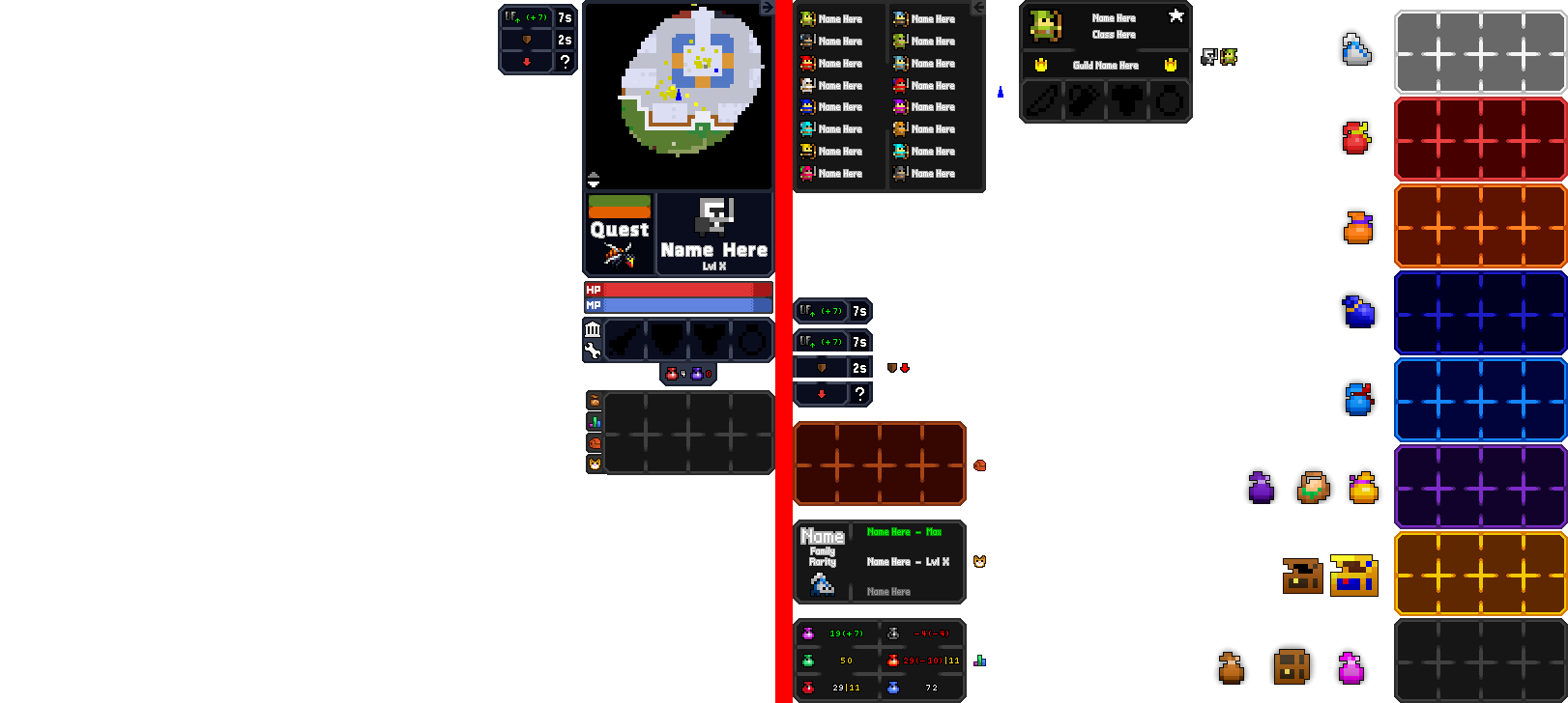
The left is purely what it would look like in-game, with some exclusions/examples. This includes the status effect bar (as it’s mostly to indicate placement), the text, and Queen Bee.

The right is all overlays, mixed with some more examples. The icons there are used to indicate what goes with what, and bags are for… well, bags. All text is purely for examples, much like the small class icons, the crown for guilds, the star, so on so forth.

Note: The font isn’t there to stay. Regular fonts wouldn’t work with the file size, so I went pixelated to make it easier on myself.

Edit: Updated HP/MP bars, among other things. Looks much nicer now.
Edit 2: Removed Egg Basket’s UI and moved both Egg Baskets and Gold Bags to the Purple Bag UI.


#2

very cool would like to see the finished product!!!


#3

Personally I find this a bit excessive, but heres some constructive criticism:

  1. The current quest system shows direction. Maybe include an arrow on the quest panel showing which direction you must move in. However, I think this would be much harder to follow than the current way where the pointer is centered around you.
  2. In a game like this I would prefer to have a larger hp/mp bar so that I can quickly glance at approximately what percent I have left. Additionally, from the looks of it, there is no boundary around the bar, making it more difficult to see what percent you have left. Finally, I recommend showing the fraction and maybe percentage of your health/mp that you have left. Example: 354/400 (88%)
    This is important because having 200 hp on a character with 400 max hp is a whole lot different than having 200 hp on a character with 300 max hp.
    I chose to round the percentage down so that you cannot overestimate how much hp you have left.

#4

The little quest bar does not affect the directional quest box. I forgot to clarify, sorry about that. (It’s there mostly so you know what your quest is at all times, especially those without the box enabled.)

As for the HP Bars, I could probably go for an outline, yeah, but I didn’t add text to the sample since I felt that it didn’t need it. We’ve all seen a health bar. No need to add arbitrary numbers.


#5

For the health bar at first glance I thought it said “100” instead of “HP.” Sorry, thats my bad


#6

oof


#7

Update added. Read main post for details.


#8

This topic was automatically closed 60 days after the last reply. New replies are no longer allowed.