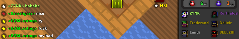
So this is quite ugly design, the new star graphic that players get awarded for being in the top 50 of Challenger Mode throws out the chat:
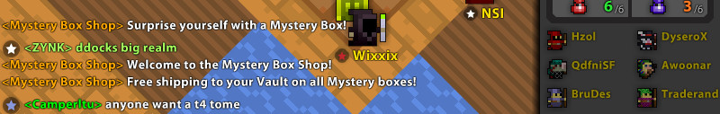
And there’s some more example screenshots of the chat being misaligned in this post:
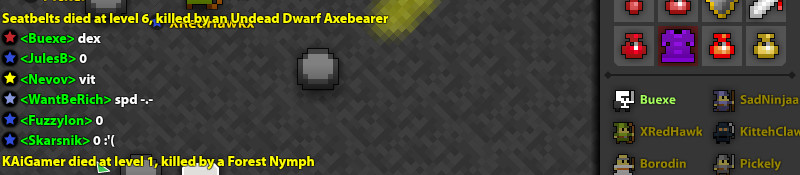
& here:
(if you want more info about the star icon rewards see this topic, halfway down the OP it talks about the Season Winner reward ranks.)