You may be asking where is the art, but there is nothing…
Have a good day might post a drawing one day
Posted by Random post for no reason gang
/s

You may be asking where is the art, but there is nothing…
Have a good day might post a drawing one day
Posted by Random post for no reason gang
/s
You didn’t even let me post my art …
I just need to refine it >:(
@Mynamerr
Please move it back 
Ty @Campfires
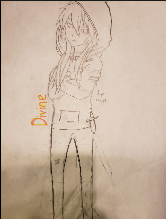
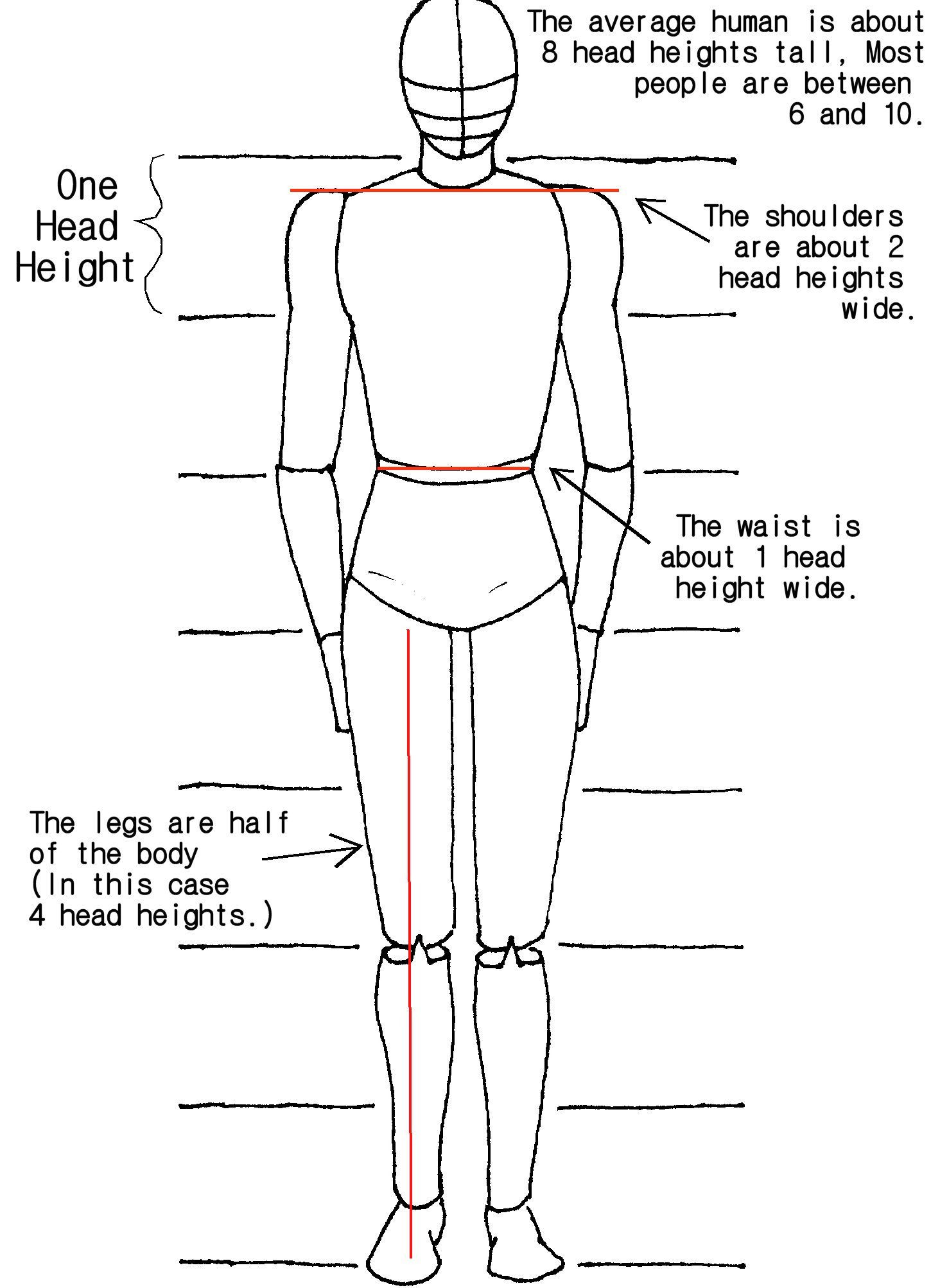
Everything is a tad small compared to the head and the upper torso, in my opinion.
When drawing clothes, you gotta remember that your outfit hardly ever clings to you like a scuba suit. If you keep that in mind, then you’ll be able to draw clothing more realistically; right now it looks like you’re wearing a skin tight latex suit rather than a hoodie (I think?) and trousers  So, picture what the outline of your character’s body would look like, then draw the clothes just outside of that, with maybe more curved edges and hanging a bit loosely from the characters skin.
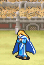
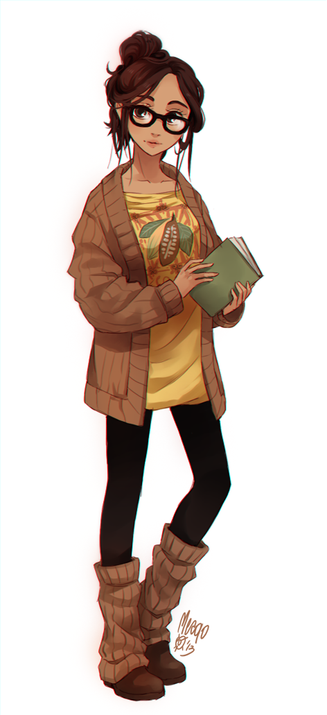
Take Lucius here; despite the pixel art it’s fairly clear that his clothes look like they’re taking inspiration from his body shape rather than rigidly sticking to him.
And here’s a more realistic drawing; you can see that the jacket is hanging pretty loosely from them, and although, yeah, it’s not actually zipped/buttoned/whatever up, you can see on the hands around the edges of the arms and near the neck that the clothes sort of follow their own route rather than just being an extension of the character’s skin.
You should also add some sort of belt, as it would enable you to stick a sheath or some sort of thing on for the dagger, which would make it, again, a tad more realistic. Right now it’s basically floating.
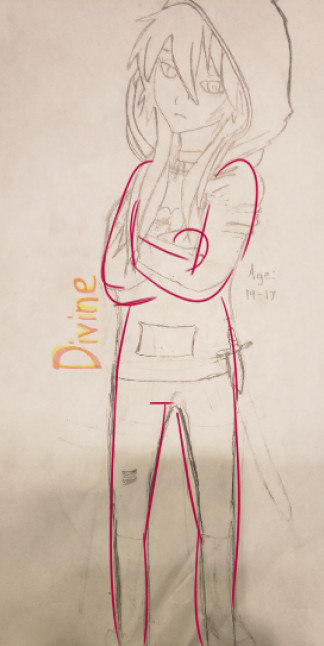
Also, don’t be afraid to give it some shape; adding slight bulges around the knees for example makes them look more human. The legs look a bit too smooth, since the character’s standing at an angle, I suggest pointing one foot forwards like they are already and one on a bit of an angle towards the side; you can even use yourself as an example, and try stand in the same posture as your character. I find it sorta uncomfortable to stand with my legs pointed forward but my body off to the side. The same applies to the pocket ( I assume?) in the hood, it should be pointing in the same direction as the character’s torso.
Honestly, the posture, body shape and clothing is all that needs to be adjusted. Shoulders up, your drawing is already pretty good looking  even if you say you ‘basically’ copied the head, there’s nothing wrong with using reference images to help you out a bit. If you don’t like that fact too much, then you can try gradually get used to the style you used and then draw your own once you feel comfortable with it.
Once you’re satisfied with it, I suggest adding some light shading under the chin and the inside of the hood, it doesn’t have to be solid pencil marks, it can just be a few parallel lines at a diagonal.

Sorry if I sound a bit critical; this is honestly just to help you out, it’s up to you if you wanna take my advice or not. It’s a good start. If I think of anything else I’ll add to this.
Thank you for the advice, first time I actually read a whole paragraph in this whole forum…
I will try to input them into my drawing so that I can improve
I’m a super new artist so idk if my opinion is any good, but if you aren’t satisfied with your level of art then you practice a bunch and learn by observing other art or tutorials. (You’ve probably heard this already)
Please do not throw it out! It’s not as bad as you may think! Your drawing is actually quite nice and probably better than my drawings. I think that you could improve it by making the legs less skinny.
The proportions are a bit off, the legs are much too long compared to the torso, and they’re on the skinny side. Beef up the legs and shorten them and/or lower the waist and I think it’ll be fine
You shouldn’t feel bad about copying things to begin with, imitating existing drawings is a good way to practice and get a feel for proportions and shapes
Not badAND DOn’t THROW IT AWAY!!! you should never be ashamed of your work, when I started out I would have been hyped to produce something as swank as this. And don’t feel bad about copying, you need to know how to draw from a reference before making more creative stuff.
Some tips:
Try using construction lines to “map” out your drawing before you draw it. It might sound beginner ish, but it really isn’t. Heck, I still do it because if I know where I’m going to put my stuff then I won’t mess up and have to start over attempting to freehand.
Another tip I would give you is giving “shape” to your drawings. Right now it’s just plain line, it has no thickness, no substance. I would recommend studying human muscle and bone diagrams (Not joking, that’s how I did it) to study the shape of the human body. We might be just drawing the surface, but what gives the surface shape is the inside.
Dagger is kinda small imo, and where is it hanging? Also the hoodie pocket needs to have thickness, it needs to protrude from the rest of the hoodie. Even though it has nothing in it, hoodies are baggy and therefore have shape, they’re not skin tight.
Try visualizing your drawings divided into facets, so you know which part is light and which part is shadow. Drawing realistically will build the foundation for drawing cartoons, abstract art, etc.
Keep on drawing, you’ll get better, I promise. My art journey is far from complete, and I put hecka work into it to get to where I am today. You’re already really good for a beginner, keep putting in hard work and effort and I’m confident you can be really good!
Gl  sorry for the unstructured rant
edit: I can’t stress the importance of watching guide videos or having an art teacher if you have the money. It’s extremely useful to have someone to critique your pieces, offer guidance, and help you along.
So how much did this lesson cost then?  But thank you for all the advice! I have a friend who said they don’t like bodies because you need to know the thing you said…
I will try what you said and all of what you guys said
If you don’t try something out because you’re unfamiliar with it, you’ll never get better.
now I’m not the best at anatomy myself but I wanted to throw in my two cents for this draw :v
it’s really good! copying stuff for reference does indeed help, as long as you’re doing it for the purpose to improve. anatomy-wise, it isn’t bad, the lines look nice overall the drawing looks smooth, but what i see first is the arms/shoulders; the shoulders are a bit bulky at the top and the forearms are a bit short. for most people, the wrists come down to right below the crotchline (which we will also get to in a sec) and using that logic for this draw, my mind tells me they’d come a bit far up which inherently makes them shorter :T
the top of the legs? they arent bad! but you have to take into consideration that she has to pee from somewhere. crotchlines arent just a point, they look like a line and appear flattened (at least from a from perspective). for the legs, keep in mind that tapering should be used. they look smooth, like how I usually draw my legs, but if you’re going for something realistic I would try to separate the leg into two parts, starting around where you would bend your knee.
i understand if all of the things I pointed out were stylistic choices, but isnce you said you’re pretty new to this then I would learn the basic anatomy and structure of the human body first before stylizing :0. it makes it easier to tell where to put things and how movement works. good luck!
This topic was automatically closed 60 days after the last reply. New replies are no longer allowed.