
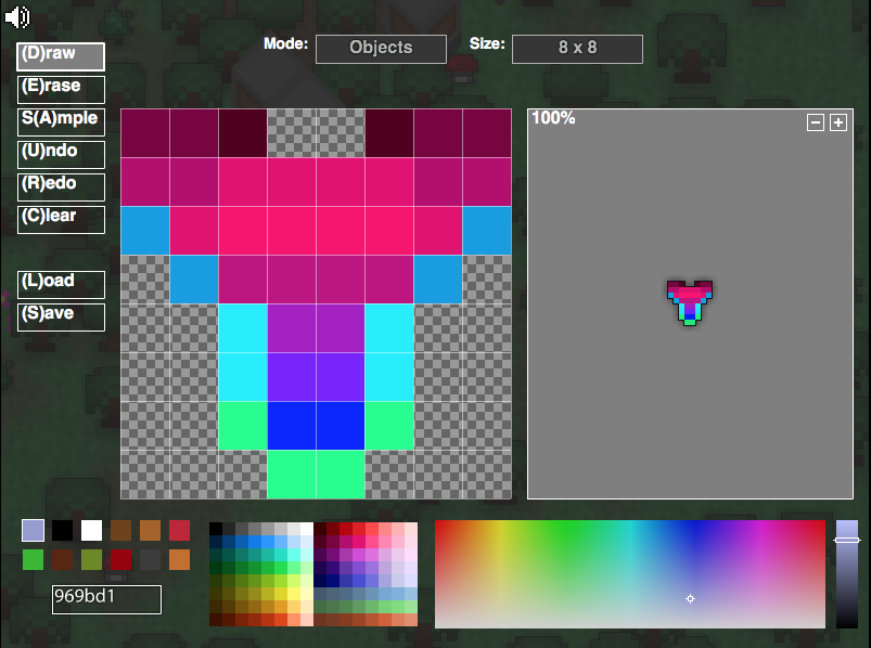
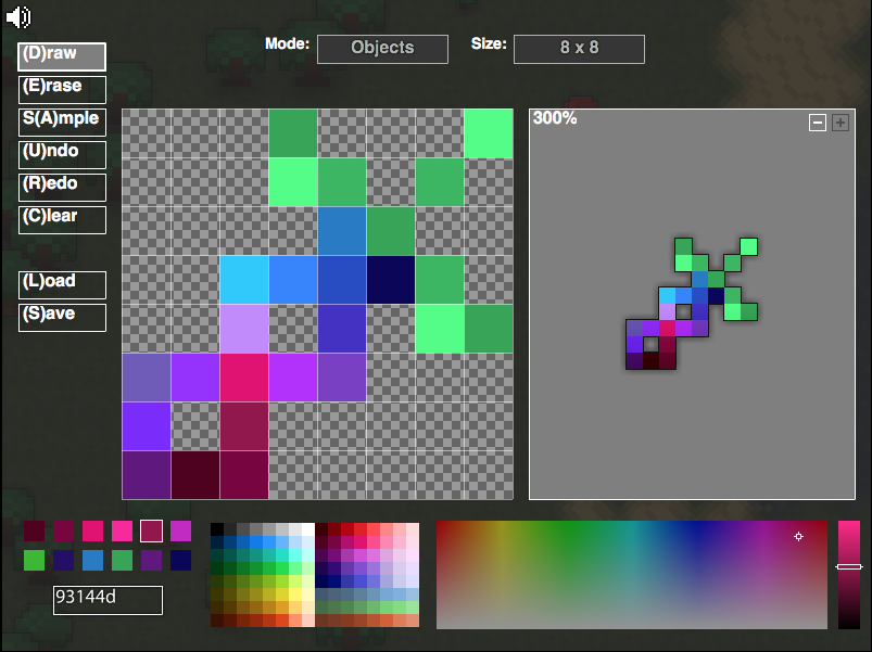
so a while ago i made the a custom sprite set i only have the sprites and haven’t really thought of the stats yet… so i just wanted to share the idea
Galactic set

MrLoaf
#2
These actually look kinda dank, but it is obvious that the sword is a re-colored sky splitter, maybe spice it up a tad. Also the armor needs the same dark purple as in the inside corners at the top to make a line below as a sort of neckline, otherwise it looks sort of odd now.
Otherwise cool, Hotline Realm of the Mad God.
[EDIT: moved to fan art because so far these are just sprites, not an idea]

Curlip
#8
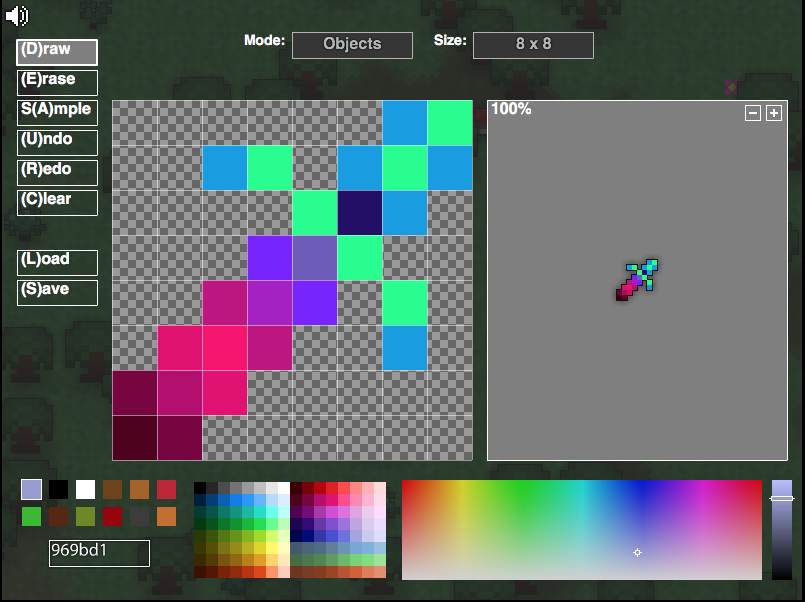
The coloring is… interesting. But I can tell what items you took the shape from on all but the shield, you got to be a little more creative than that
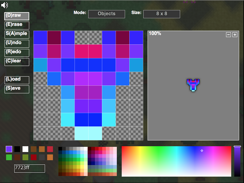
Rammernaut
#9
Alright…
The armor is literally an embodiment of LSD, but that’s alright, it does need a neckline though, so add that in, apart from that, try making the transition between colors a little smoother, it looks a bit jumbled at the edges.
The sword is a typical sword, I like the blade coloring, but the hilt could use some recoloring, it doesn’t fit in well and looks pretty strange.
The shield has a nice shape. but the coloring is, once again, a bit off, make those turquoise things blend in with the shield, making it match the outer edge would be nice.
The ring is pretty good, even though the shape is ![]()
Quite identical, the coloring looks fabulous, I love this one.
Overall i would give you a 7/10, Great Job!
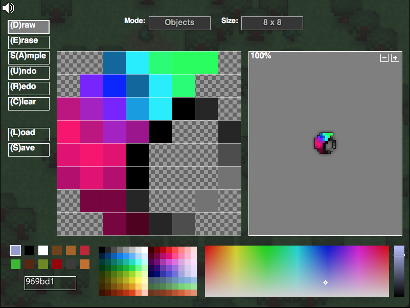
SkySplice
#10
The ring is a recolor of the ring of burning sun.
Idk what the shield looks like, it hurts my eyes.
The sword is an obvious recolor of sky, although it looks okay.
The armor also hurts my eyes xD.
Stuartcat
#11
Armour: Alright, the turquoise is a little harsh on the bottom, but otherwise cool.
Sword: Absolutely stunning, really like this one.
Sheild: Absolutely horrifying, imo, that extra grey pixel on the bottom right, the way it awkwardly outlines the shield…looks like a nut/bolt in the middle of it.
Ring: Yeah pretty cool although the transition between the two colours could be a tad more smooth. Also for the dark band I would make it more uniform (either all more grey or all more black).
Looking aight
Irockboss
#16
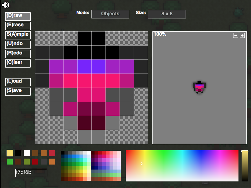
so i was going and experimenting with some new sprite ideas and editing some others … plz give some feedback
heres the new armor sprite
new ring sprite

new sword sprite
Hob
#18
My eyes are blinded. These are not very well shaded tbh and shapes are overused especially the new sword. But then again, i might be picky, and there is partial effort on this set