
Here is my small contribution to the community!
For the technical side, reffer to this video by @Poshun and to the guilde below by @PwrNewAcct
https://www.youtube.com/watch?v=shDVhlj6E20
Study phase:
Choose a theme, keep in mind that details will be limited by the size of the sprite. You sprite has to have pecularities that gives it its own identity. For example, the plague doctor skin is identified by its mask, that immediatly puts it into a specific context.

On the other hand, trying to represent something like a watch wouldn’t work very well as it will be hardly identifiable on a skin.
Once your idea is set, looks for reference images. You can also look for sprites from other games.
Then, design basic layout of your sprite, while keeping in mind the rotmg artstyle. Unless it is specific to the theme of your sprite, do not try, for example, to put the shoulders of you character 1 pixel up, or to draw arms one pixel longer. But again, some sprites will need you to get away from the standars, like the hunchback skin.

While designing a character, you also have to keep in mind how you will animate it. You can study existing animations.For ennemies, you will need fewer animations (front, walk, fire).

That one for example would be hard to represent front, as typically characters heads are 5 pixel wide. Represented front, it would still have to look at one side!
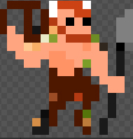
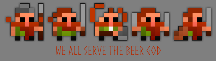
For 16x16 sprites (i.e. bosses) the work is quite harder. As you have more design space, the stance of your character will be unique. Trying to represent it static (like smaller characters) will make your sprite very bland. In that case, I recommand going through a good number of steps before working on the details of your sprite. It helps you to organize the different compenents of your sprite in the space. Here is my first try as an example:

The beer god I used as inpiration.
The rought draft of my character:
I then did some stance polishing, and edited the sprite component by component. After the polishing, I ended with this:
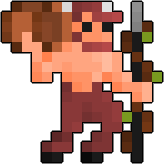
I wouldn’t have ended up with this result if I tried to draw diretly the final version. Notice how the legs, the torso and the right arm breaks the stiffness of the sprite. It also gave me opportunities for the animations:
Shading:
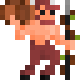
For shading, choose a light source first. Following the same example, you can see that the light is coming from the right. That’s why its torso is lighter on its left side than on its right. Shading from the left would have been a bad choice, as from a perspective point of view, the darker areas would have been hidden from the viewer, and the sprite basically bathed in sunlight.
And here we come to my main contribution: color
Color is defined by a few characteristics.
-hue (yellow, red, green…)
-saturation (a saturated color will be flashy, while a desaturated one will be like worn-out).
A saturated color is pure, while a desaturated color gets greyish.

-value (reffers to the lightness or darkness of the color).
You can try to understand how those three parameters work with each other in the rotmg sprite editor.
Now, how those parameters can be used?
For shading, the main thing you will do is modifying the value of your colors. Shading is essential to give deepness to your sprite. That one is an example of what to avoid:

No shading at all except the natural down shading of the game. it looks like it was printed on a papersheet.
Saturation can be used many different ways.

On those sprites, I chose to give a light saturation to the colors I used. It is kind of soft to the eye. While this sprite jumps out of my sceen, it is far too neon-like (purple and blue pixels):

You can use saturated colors to draw the attention on a detail of your sprite, it usually represents glowing areas.
Those unsaturated colors, here, gives a feeling of a reflecting crystal. Saturated colors would have game the feeling of a colorful carnaval scepter.
Finally, you can try to represent small details (smaller than 1x1 px) by using interval colors.
On the sprite of the far right, you will notice that one of the eyes is colored between black and orange. That represents a lock in front of the eye. If the color was fully orange, the eye would have felt completely covered.
(To be continued)