

Paladin set
Smirror
#6
chill m8 I have nothing against you. Don’t make fun of my efforts please. I poured my soul into these sprites.

Leohe
#11
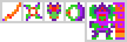
As noted, tone down the colors. If you haven’t noticed yet, almost every single sprite is dark in it’s own way. Even omni, which appears to be white, manages to look like it has a dark color because, at least in our good 8*8 game (and pretty much in every game), darker colors look more realistic then bright colors. I would suggest some shading and switching some of the brighter colors to darker colors. Also, just saying, ignoring brightness, I dislike the shape of the ring and believe that you are simply using too many colors for the majority of the items. Keeping it simple also makes it easier to build upon
Smirror
#12
so what about every item in the ut priest set, sunsine shiv, bunny helm, mseal, jugg, dancing swords, leaf dragon, water robe, fire dragon, new life, all cland items, and all that garbo?
BaraBlazer
#13
Shading. You’re lacking that at the very least. Also, you’re using Neon colors VERY liberally. It looks like a heat scan. You’re gonna need to explain what these are supposed to be. The color contrast is all missing. No complementing colors (Blue/Yellow, Red/Black, Purple/Yellow, something something color theory). In result, it feels chaotic.
In a sense, color wise your previous sprite has better color balance. Green complements purple and orange, but it brings the Joker/Levity feel. It also doesn;t help that the base shape feels off. This time, the base shape seems quite on point, but the coloring is more chaotic.
If this is supposed to be like a vaporwave set, I can see it working, but that’s why I asked for some explanation to what this set is supposed to be
PIGGIESFAR
#14
not an experienced artist here, but ill give some honest feedback
- imo the color choices hurt my eyes. the stark contrast of all those clashing neon colors makes for a wacky set.
- shading: items in the game are shaded to give them dimension and to make them feel “real”. currently, there is no shading in the set
suggestions:
- choose a smaller color palette with a few main colors (two seems like a good number) and accompany those with various shades of darker and lighter color.
- keep it simple. a lot of the time the most elegant implementation is the best
TL;DR: you have a lot to learn, young padawan
Leohe
#15
Although they are technically light colored, they definitely are’t bright and have a part of them that makes them look shaded in their own unique ways
Gidey
#18
whoops… I didnt realise that. Oh well. at least the sprite is more likely to get fixed now.