Lost Halls 3.0 Resprite


#1

Been a while since I did these, compared to my older iterations this one is a massive upgrade, at least that’s what I believe.
Old resprite in case anyone’s interested.

0

As always, I’m happy to take any kind of opinion anyone has about these resprites!


#2

look like pserver whites, no offense. Cult ring and robe have potential and i think the skull should be a white somewhere else. i dont like the archer set but the rest is pretty good except potato.


#3

These look incredible, but also a little too over-shaded compared to standard rotmg item design. Most items have only a few colors, with each color having at most 4 shades (there are a few exceptions like void bow). I think if you simplified the shading, these could fit into the game nicely.


#4

They feel quite overdesigned now and the shades are too dark in my opinion. Each item feels very unique, which would usually be a good thing but they feel too different to the other items in the sets (besides the Paladin set).

Perhaps you could simplify and lower te contrast between shades and make some designs more basic?


#5

Maybe I should say this at the beginning, my goal is not to replace original rotmg sprites, but instead to just make them in my own style.

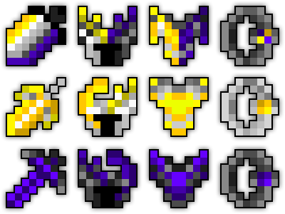
Does it matter though? Is pixelart not supposed to be experimenting with different things? For realm, keeping 3 shade is alright since that’s what the entire game is using anyway, but making it “norm” for lower-res pixelart is pretty much outdated in my opinion.

And why is that? Original cult skull doesn’t fit cult one bit, why the crown? Mine is meant to be closer to skull of a demon, which would fit cult much better in my opinion.

Archer set was very experimental, personally it’s my 2nd favorite from the sets I made but it probably comes all down to preference. Potato tbh I couldn’t think of what else I could make it into, was supposed to be eye of the mbc but it turned into baked potato I guess.

Honestly I don’t know how to answer that one. I believe that especially in cult and void the sprites do what exactly they’re supposed to do, void following chaotic theme (although I think that I could do void bow better), while cult being bloody/demonic.


#6

now deca just needs to hire you to resprite all items and then give you $10 in realm gold


#7

It doesn’t matter if your goal was just to make them in your own style! I didn’t know that was your intention. If you had been trying to replace the sprites, it would be best to keep within rotmg’s existing style; a coherent style across all art is pretty important for game design.

I don’t have much other feedback, like I said your spritework is very good! Please share more in the future if you continue this work :slight_smile:


#8

I’m pretty sure that the problem is your post title. It implies that these sprites that you’ve created could be used in a possible 3.0 version of the Lost Halls dungeon. Naming it something like “My Lost Halls Item Resprites” avoids accidentally setting the wrong expectations. I don’t want to assume that you intentionally wrote somewhat of a YouTube clickbait title in order to get more views, but you should be more careful with how you word your posts. This ain’t Discord where you can post and delete your messages so easily without others noticing.


#9

They may not be very realm-like as others have said, but for your own style these are still interesting to see! Regardless of what anyone says about style, they’re certainly a hell of a lot better than whatever travesties I once tried to pass off on the original doc.

image


#10

Most of these are either too messy or too simple, which is a strange duality of issues to have. The Cultist Hideout set is actually decent save for robe and ring, which are too simply shaded for RotMG’s style. On the other hand, Void and Lost Golem sets are too messy and blurry. Marble set has half of each issue, with the sword and breastplate being a bit too simple while seal and lodestone are a bit noisy. I don’t know how good you are at spriting currently or back then, but how do you manage to make stuff that’s both too simple and too messy??


#11

Some were created/edited by some other contributors to the original doc, namely Wunderwafe and Typemaster, which definitely had some hand in the inconsistent styling. Think the cult set is the only one that was entirely my own with no edits.

The other factor was just me being completely clueless at the time.


#12

A bit late, but I love how you’ve done Collo Sword, the entire cult set, Vbow, Garms, and Cuffs!


#13

Honestly I didn’t even think a lot about the name, it was made this way just because I think that’s the third time I resprited lost halls sets.

I recently looked throughout the original lost halls document for fun with friend… and oh my god. It was actually painful to look at. Well, not like my old sprites were any better though.
Equinox_stuff
I don’t even know what was in my head when making THE sword.


#14

These ones look over-designed for 8-bit sprites. I can understand what you’re going for with each sprite, but neither do they look good within their limited canvasses nor do they fit RotMG’s style. Oddly, I can see exactly how you got to making that sword. You tried to combine white with purple and yellow to resemble a sword infused with both powers, but instead of adding hints of both colors to the sprite you just slapped lines of shades next to each other. I don’t want to be one of those guys who tries to “fix” people’s art, so I’m just gonna give a recommendation and say that you should make it seem as though a yellow and purple aura is surrounding the sword in some way, like making purple and yellow spirals around the blade.


#15

Those sprites I sent are from over 4 years ago.


#16

mathicianpost
I’m not Spanish I hope I’m not being racist please don’t cancel me on Twitter I mean X I mean fu


#17

i truly love how potato the potato is™


#18

This topic was automatically closed 60 days after the last reply. New replies are no longer allowed.